
As an applied economist, I am often interested in the causal interpretation of results. I take this task seriously, and I therefore specialize in both major paradigms: applied microeconomics and experimental economics. In other words, I aim to arrive at a causal interpretation of my findings regardless of whether I have control over data collection.
Lately, I have been grappling with the former, working with data that were neither collected nor structured to answer the questions I have in mind. It feels like when my wife makes her sweet cookies: she chooses the right recipe, but we only have the healthy versions of the ingredients, and some essentials, like sugar, are missing altogether. She bakes with what is available rather than what the recipe calls for. The result, while impressive given the constraints, is often far from what she hoped for, and the sooner one accepts this, the sooner the path to causality appears (or, at the very least, the sooner we enjoy our healthy cookies).
My Case Study
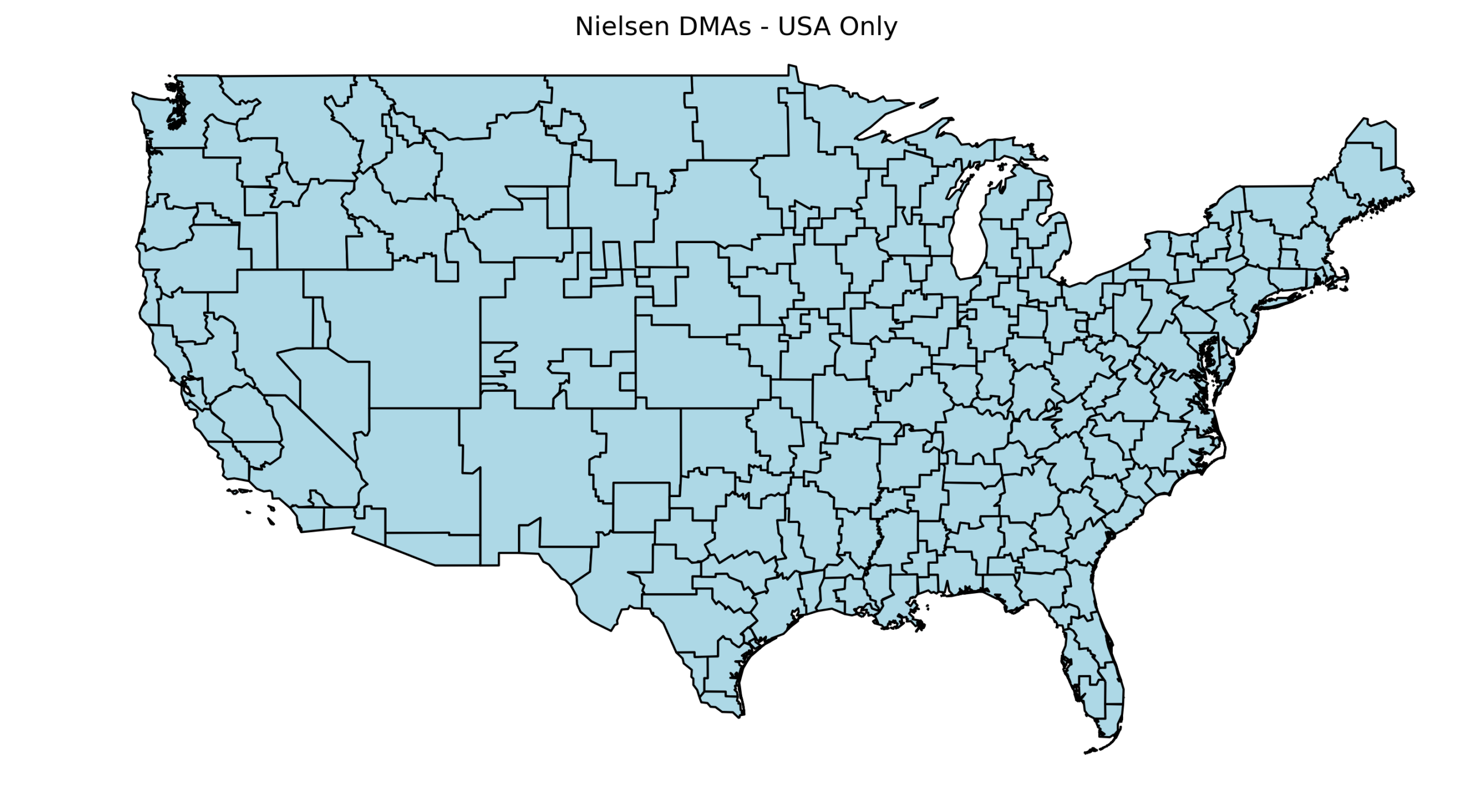
I recently had to make a decision regarding comparable units of cable TV viewers. By design, not every American resident has access to the same cable channels; instead, each provider must include specific local broadcasts serving the residents in their area. To territorially distinguish these areas, the Federal Communications Commission (FCC) adopted the term Designated Market Area (DMA) to describe the territory, specifically 210 of them. A territorial decomposition is shown in the graph below using data from GitHub.
I was interested in whether such assignments might somehow affect certain beliefs of viewers across these DMAs. Ideally, one would like to take a sample of people and randomly assign them to these DMAs. Nevertheless, people are free to choose where they live, messing with randomization. As a result, individuals self-select into places according to their predisposed characteristics, making any comparison noisy at best. In these situations, generally speaking, one needs to get a bit creative and figure out how to overcome this hurdle. In what follows, I describe one possible approach.
The Trick
The approach I am using builds on discontinuity design. In simple terms, a discontinuity design assumes that there is a clear cutoff point around which assignment is effectively random. For example, if we wanted to assess how successful an elected official was, we could focus on very close elections. When the margin of victory is extremely small, winners and losers are nearly randomly determined.
In spatial analysis, like the one I am working on, the discontinuity design needs to be adapted. Even though people can choose where to live, one can argue that if we look at residents very close to the border between two DMAs, the choice of living on one side or the other is essentially random. By comparing residents on either side of such borders, we can make comparisons with an arguably causal interpretation. Of course, applying this approach in practice is more complex than it sounds.
Choosing the Comparable Units: No more assumptions, please!
As always, the intuition behind this method is appealing. The problem, however, is that once we confront the reality of available data, adjustments are required. Additional adjustments often rely on extra assumptions, something any researcher tries to minimize. My intention here was the same: to select bundles across the DMA border consisting of comparable pairs, so that each is exposed to a different mix of cable broadcasts. The question then becomes: how can we choose these pairs given the constraints of the data, while making as few assumptions as possible? This inevitably introduces some trade-offs.
The algorithm composition
First, I compiled a list of all DMAs in the U.S., sorted not by territory but by the number of households they cover. This list can be found here. The logic was to loop through each DMA and, in each case, select pairs from the inside out.
I also had to consider the limitations of my data. I worked with microdata, a survey about respondents’ perceptions of crime in their neighborhood. The data were not collected in a panel structure, meaning that for each year, a different group of individuals responded to the same set of questions. The most granular spatial unit available was the ZIP code, making it the most detailed way to assign residential locations.
Short digression: ZIP code spatial critique
ZIP codes are often criticized because their boundaries are flexible and can change over time. They can expand or shrink, and in a strict sense, they do not represent true geographical polygons as counties or states. Nevertheless, there are several “good practice” measures to mitigate these limitations.
In my case, using ZIP codes was justified as they were the smallest available unit of information about residences. I aimed for the highest precision possible, even if the geographic boundaries were not perfect. For example, using counties would necessarily provide less precise information, as counties can be large and internally diverse. Placing individuals within ZIP code boundaries, although not perfect, gives a better sense of where participants live within each country. Ideally, one would work with addresses if available. But in their absence, ZIP codes are the best option.
Additionally, some official sources provide ZIP code polygons, such as shapefiles from the U.S. Census Bureau. They are updated every ten years, so one can account for changes in ZIP code boundaries over time.
The Ideal World (What If…)
Imagining a counterfactual is always useful. It gives the researcher a sense of what could be done under ideal circumstances and guides how to emulate it as closely as possible. My ideal counterfactual would be to have complete data on all residents in ZIP codes along DMA borders. Then I could focus on adjacent ZIP codes on either side of the border. However, with my survey data, the adjacent ZIP code strategy would not have provided enough power for my analysis.
Inspired by Spenkuch & Toniatti 2018 , I decided instead to connect adjacent counties. This approach offered several advantages. It allowed me to link comparable units while retaining more detailed information about residency at the ZIP code level. I could include nuanced regressors that would otherwise be very noisy at the county level, such as ZIP neighborhood voting patterns or ZIP crime rates. For example, Kings County (Brooklyn) contains highly heterogeneous neighborhoods, and using county-level data could obscure this variation. Additionally, I was also able to implement weighted regression designs, giving more weight to ZIP codes within a county bundle that are closer to the DMA border. Similarly, I used shapefiles from the census.
New York example
First, let’s start with the largest DMA, New York (see Graph 1). The algorithm runs in a loop, applying the same procedure to each DMA.

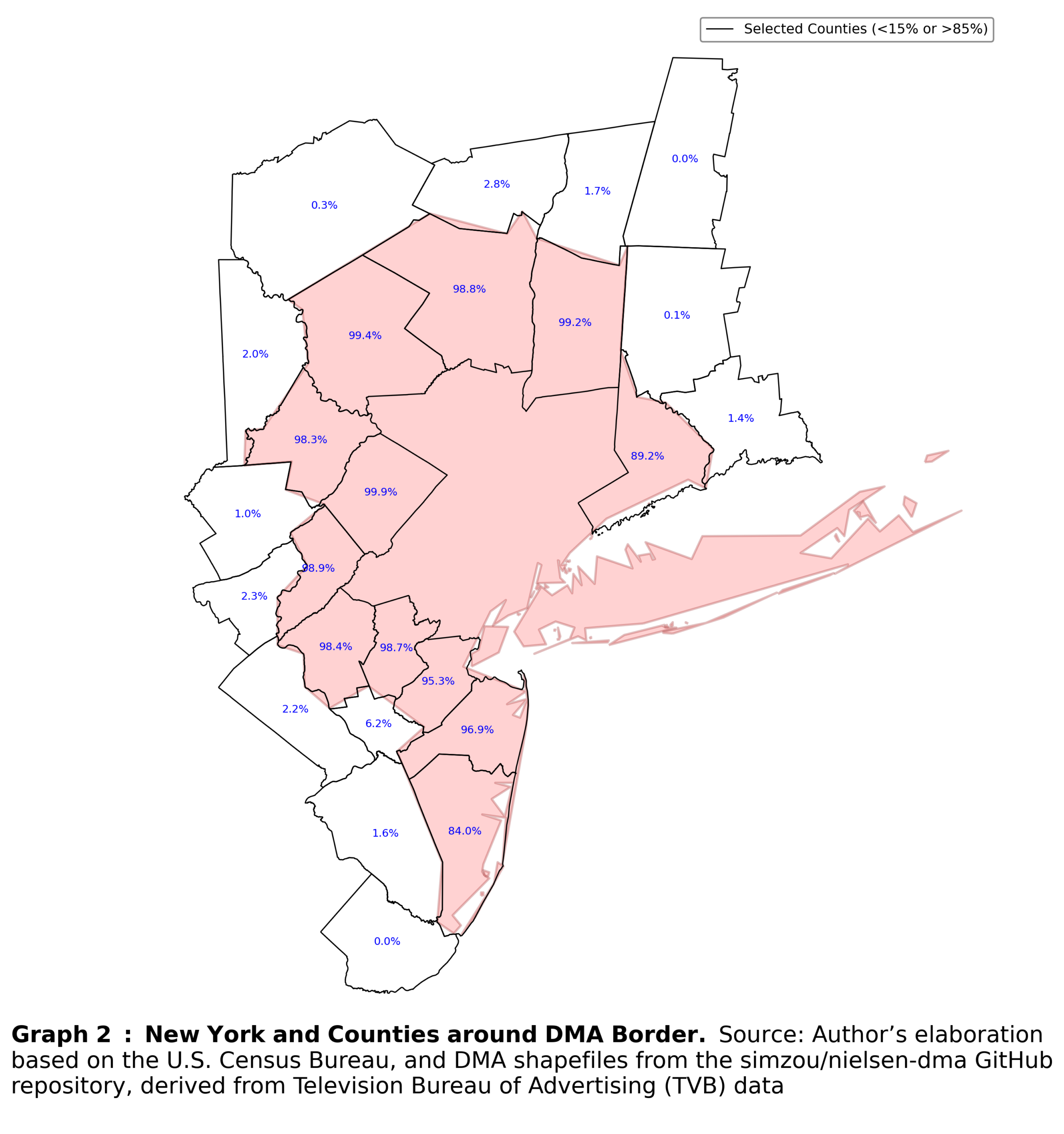
Even connecting adjacent counties and creating comparable bundles becomes more complicated in practice. First, I established a firm DMA boundary and created a three-mile buffer zone both within and outside the border. That allowed to retain only those counties that lie close to the DMA boundary.
Second, I had to assign counties to comparable bundles. Even in this simple step, assumptions were unavoidable. In most cases, counties are aligned with DMA boundaries, but the overlap is rarely 100 percent, especially for border counties. To address this, I applied a general rule requiring that at least 60 percent of a county’s territory overlap with a DMA for it to be considered part of that DMA. At first glance, 60 percent may appear too low; however, in practice, most counties overlapped by 98 percent or more with a single DMA. This rule, therefore, serves as a pragmatic way to handle this minor but unavoidable imprecision.
Finally, I imposed one additional assumption: every outside county must have at least one nearby inside county. Specifically, the distance between the two must not exceed one mile. This ensures that counties are paired not only when they are adjacent, but also in a way that is immune to minor geographic features, such as rivers or small natural barriers, that would otherwise prevent comparable counties from being matched. The results of these procedures are shown in Graph 2.
Matching procedure
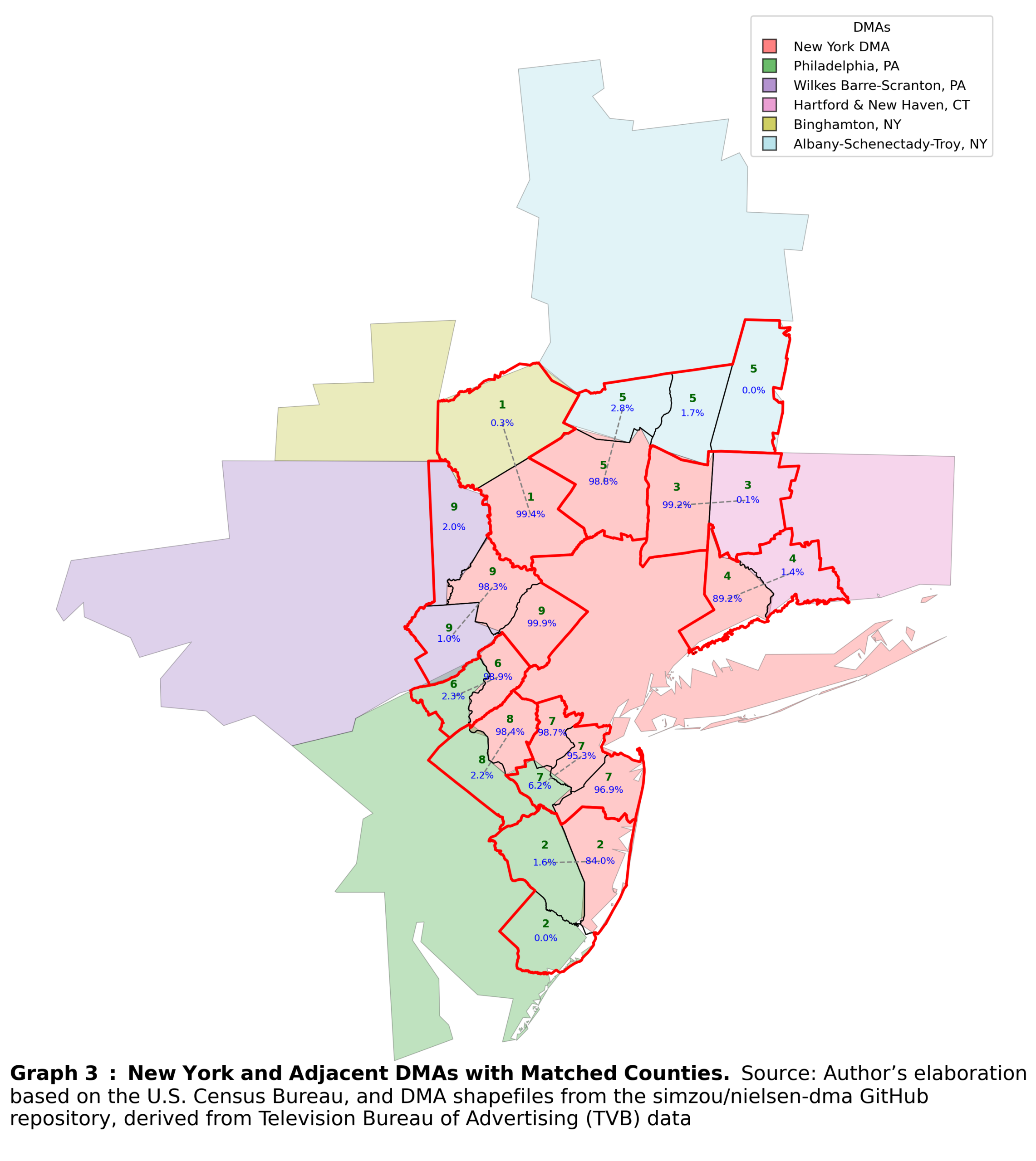
Once counties around the DMA border have been filtered and divided into those that fall under the DMA and those that do not, the matching procedure can begin. This procedure consists of several steps with a strict order.
First, I constructed centroids for each county, and matched each county outside the DMA border to the closest county inside the border. If two outside counties are matched to the same inside county, the closer outside county is assigned the match, while the other remains unmatched.
Second, I treat only counties that remain unmatched. Because these counties are more sparsely distributed, additional rules are required. First, counties must be adjacent to be eligible for matching. This prevents cases where a centroid might otherwise match to a county that lies behind another county, resulting in an erroneous pairing. Second, the shortest distance must be mutual: the closest outside county to an inside county must also be the closest inside county to that outside county. This rule avoids weird matches by prioritizing outside counties.
The third step effectively repeats the second step, again focusing on counties that remain unmatched after the first two rounds.
In the fourth step, I take the remaining unmatched counties and the formed bundles and recompute centroids for all of them. Each unmatched county is then matched to the nearest existing bundle, provided that the county and the bundle share one of the two DMAs. This ensured that each bundle continues to consist of only two DMAs. Basically, this step expands existing bundles rather than creating new ones. The resulting bundles are shown in Graph 3.
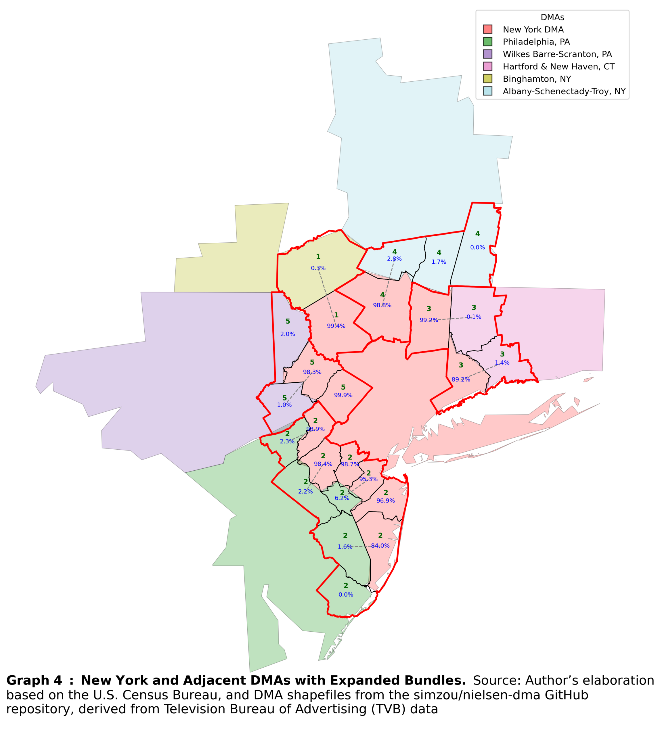
The fifth step is optional. As discussed earlier, one must attenuate the optimal method with the limitations of reality. In my case, the sparsity of the survey data required additional statistical power within individual bundles. Therefore, I further merged adjacent bundles that consist of counties belonging to the same pair of DMAs. So, the bundles are further expanded, but still consist of only two DMAs for comparison. Bundles created after this step are shown in Graph 4.
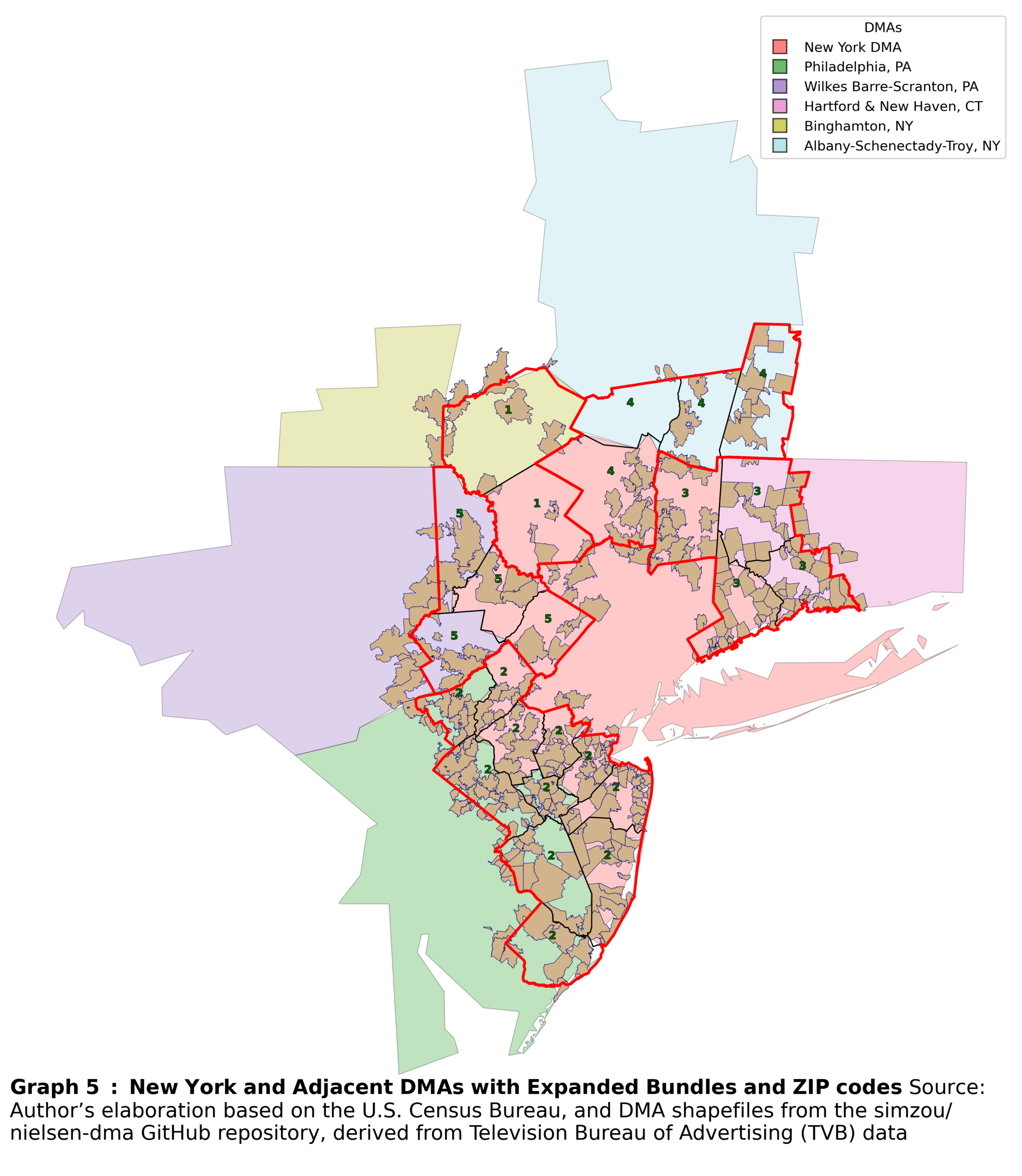
Finally, I incorporate ZIP codes into the bundles. First, I recalculate the overlap between ZIP codes and the already filtered counties. Each ZIP code is then assigned to the county with which it has the largest overlap. This approach offers further refinements. For example, one can measure the distance from each ZIP code’s centroid to the DMA border. This distance can then be used as a weight in regression. Incorporating these weights strengthens the comparability assumption underlying the spatial discontinuity design described earlier: ZIP codes farther from the border receive lower weights, while those very close to the border receive higher weights. An example for the New York DMA is shown in Graph 5.
The troubles do not stop there
The bundle creation process was less straightforward than I initially expected, and its iterative design running separately across DMAs required additional assumptions to deal with various duplicates. As always, the specific decisions one must make depend on the circumstances. Within the boundaries of rigor, these decisions are ultimately guided by the data.
My main issue, and an important one, was the low number of observations. A common critique of discontinuity designs is that focusing only on observations very close to the cutoff point, and whatever distance that may be, necessarily discards a substantial portion of the data. This is never desirable. While such data loss may be less problematic when working with large datasets, that was not my case, as I relied on a representative survey.
The data loss is even more severe in the context of spatial discontinuity designs. DMA borders tend to be sparsely populated and more rural. As a result, I was at risk of losing urban ZIP codes, which, due to higher population density in urban cores, are much more likely to appear in survey data. In effect, I was discarding the majority of my sampled observations.
For this reason, my goal was to design a systematic approach to comparability that preserved the spatial logic of the design while avoiding further erosion of the sample size.
Trouble 1
Because of the iterative process, the same ZIP code may appear in duplicated bundles, once as part of a high-overlap county when a DMA is central to the loop, and once as part of a low-overlap county when considered from an adjacent DMA’s perspective. This issue requires a simple fix, keeping only one unique bundle assignment per ZIP code.
Trouble 2
It is also possible that a bundle remains in the dataset even though it contains only a single ZIP code on one side of the DMA border, either inside or outside. Because such bundles do not satisfy the comparability requirement, these standalone ZIP codes are removed.
Trouble 3
Another complication arises when a ZIP code is assigned to different bundles created from the perspective of different DMAs. In this case, I loop through all bundles that contain duplicated ZIP codes and remove the ZIP code from the bundle with a larger number of ZIP codes available. This step is driven purely by data scarcity; random elimination would otherwise be a defensible alternative.
Trouble 4
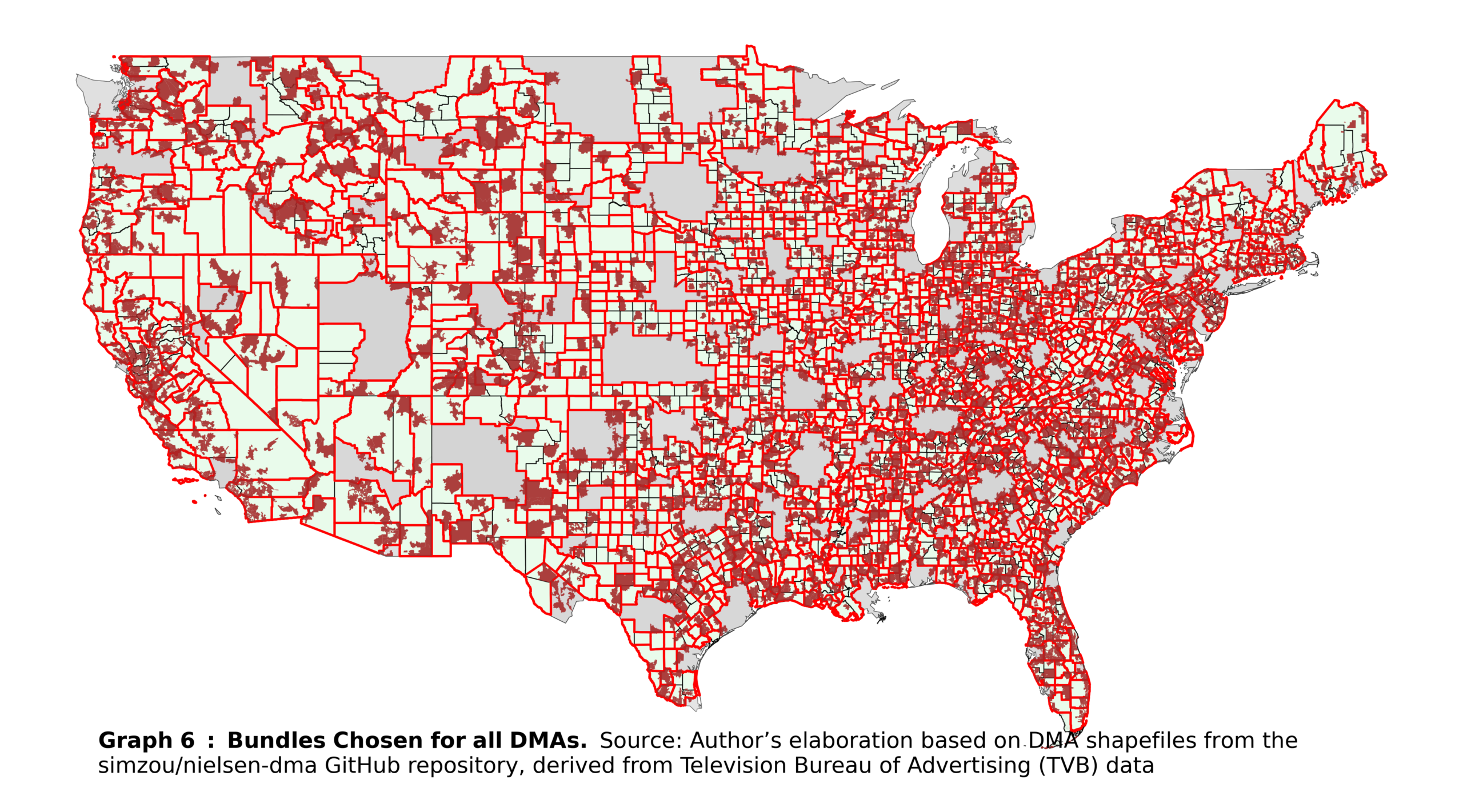
Duplicated ZIP codes may still remain after these steps when a ZIP code is the sole representation of its county. In such cases, there is no alternative but to randomly eliminate the duplicate, which results in the loss of the entire bundle. After completing this procedure, all ZIP codes are uniquely assigned to bundles (and, by extension, to counties). An overall map of the United States, showing the final bundles and ZIP codes, is shown in Graph 6.
Final remarks
The previous section effectively illustrates the creation of comparable units, called also ‘bundles’, for a spatial discontinuity design. The actual process of constructing these units requires a degree of ingenuity. As a general rule, the closer the units are to each other, the more justifiable their comparison. Nevertheless, data limitations often require creative solutions to overcome these constraints. My algorithm represents just one example of such creativity, and other approaches could certainly offer potential improvements or alternative strategies.