In my recent project, I used two controls in separate parts of the analysis. The first was home value in the respondent’s neighborhood, and the second was the dominant partisan affiliation of that neighborhood. With both measures available, I thought it might be interesting to plot them together. Although I did not have a specific expectation about their relationship, I found the resulting patterns quite interesting.
Home Values Evolution Through the Years
I first graphed the overall Zillow Home Value Index (ZHVI) from 2017 to 2025, covering the Trump and Biden administrations. The evolution of home values follows a familiar pattern and is broadly consistent with series published by FRED and Zillow. The main difference is that the values in my sample are somewhat higher because I use only ZIP codes that can be merged with my actual survey data; these respondents are less likely to live in areas with particularly low home values.
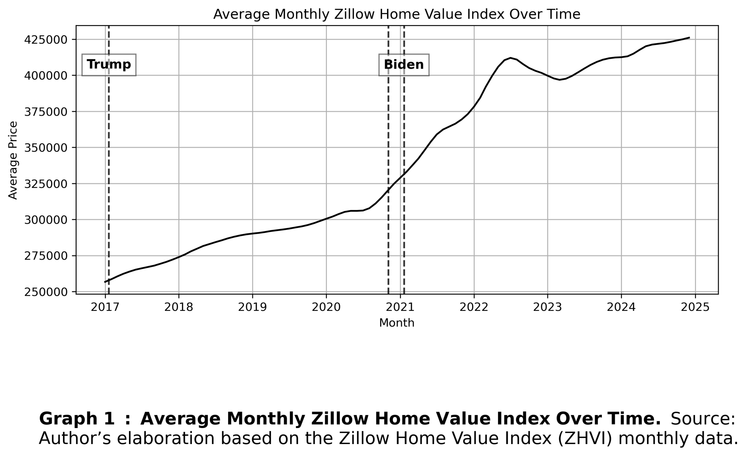
The graph shows the evolution of home values since 2017. Values rose between 2017 and 2020, paused briefly in 2020, and then increased more rapidly until roughly mid-2022. This post-COVID increase has been attributed to a combination of factors, including strong housing demand as many people looked for larger homes better suited to remote work, fiscal stimulus, a growing share of the population entering prime home-buying age, low mortgage interest rates, and limited housing supply during the pandemic (Duca & Murphy, 2021; Klein & Cui, 2025; Freddie Mac, 2026).
This pattern began to reverse in mid-2022, as housing affordability tightened after several years of rapid value growth (Richter & Zhou, 2024) and borrowing became considerably more expensive due to elevated mortgage rates (Freddie Mac, 2026). After that point, home values appear to have returned to a trajectory closer to the pre-pandemic trend.
Home Values by Neighborhood Partisan Affiliation
My project also allows me to break down this price increase by neighborhood political affiliation. I measure partisan affiliation as the proportion of ZIP code residents who voted for the Republican presidential candidate, Donald Trump, in the 2016 and 2020 elections. I then divide ZIP codes into quartiles to examine how home values evolve as the Republican vote share changes.
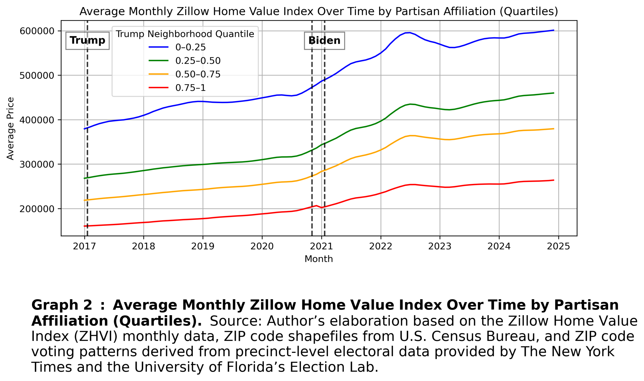
Although income groups are not perfectly aligned along partisan lines, as lower- and lower-middle-income individuals tend to lean Democratic and middle- and upper-middle-income individuals tend to lean Republican, importantly, the upper-income group tends to lean Democratic (Pew Research Center, 2024). Along with higher incomes, Democratic-leaning voters are also more likely to rent and live in urban areas (Pew Research Center, 2024), where home values are generally higher.
Two observations are especially interesting. First, the COVID-era shock described above is more pronounced in ZIP codes that lean more Democratic. One possible explanation is that Democratic-leaning areas are associated with higher rates of remote work and saw larger increases in working from home after 2020 (Cowan & Garcia, 2024). This may appear in the graph as stronger demand pressure in Democratic-leaning areas. It is also worth noting that COVID policy responses and behavioral changes were themselves fragmented along partisan lines.
Second, the gap between the lowest and highest quartiles widens over time. In the baseline graph, the gap was approximately $218,000 in 2017 and increased to around $328,000 by 2025.
Narrowing the Gap 1: Big-City Exclusion
Because Democratic and Republican voters tend to live in different types of places, with Republican voters more concentrated in rural areas and Democratic voters more concentrated in urban areas, I examined whether excluding the largest cities would narrow the gap. I identified the FIPS codes for counties that contain the 20 largest U.S. cities and excluded them from the graph.
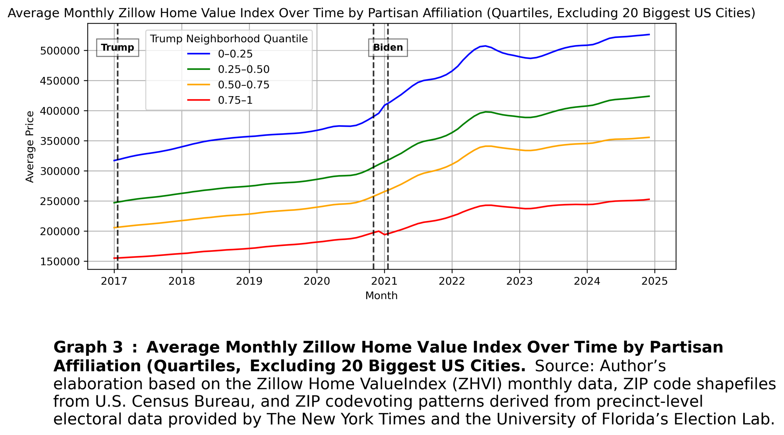
The importance of demographic and geographic differences between Democratic and Republican voters becomes visible after this exclusion. The graph shifts downward, especially for the first quartile of ZIP codes, those that are the most Democratic-leaning. The COVID-era disruption still appears more pronounced in ZIP codes that voted more Democratic, but the home-value gap between quartiles shrank. In 2017, the gap was roughly $162,000, while by 2024 it was around $273,000. Excluding big cities, therefore, reduces the gap, mainly by lowering average home values among ZIP codes with larger Democratic vote shares.
Narrowing the Gap 2: Urban/Rural Classification
Next, I merged my observations with Rural-Urban Commuting Area (RUCA) codes, which provide a rural-urban classification scheme. RUCA codes classify areas into 10 categories, including metropolitan areas, micropolitan areas, small towns, rural areas, and their commuting zones. I kept only categories with sufficient ZIP codes in each quartile, although RUCA categories 2, 4, and 10 would likely benefit from larger sample sizes.
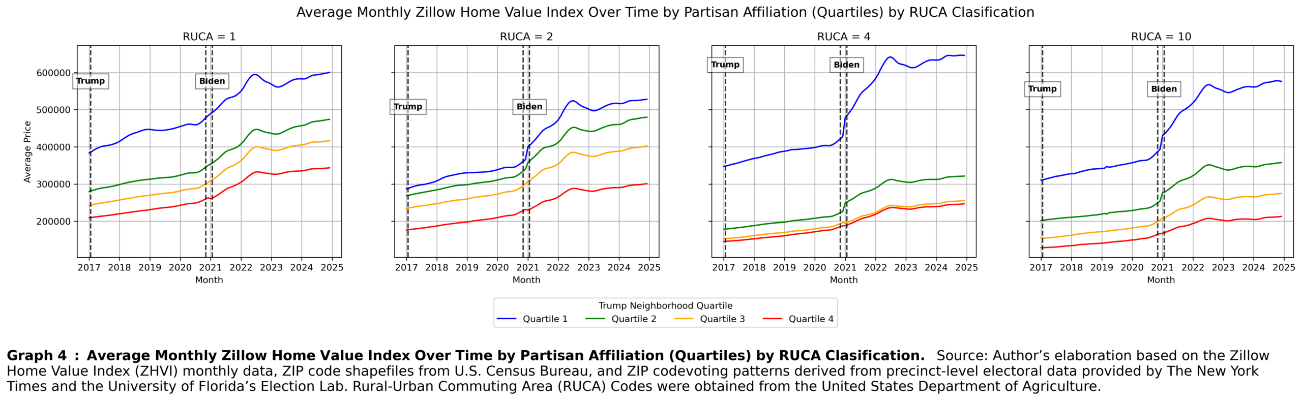
RUCA = 1 refers to the cores of metropolitan areas. In this category, more Democratic-leaning areas exhibit home values similar to those shown in the baseline graph, while more Republican-leaning areas shift upward. This is consistent with the idea that Republican-leaning ZIP codes in the baseline specification are likely overrepresented in rural areas with lower home values, which are excluded from the RUCA = 1 classification.
RUCA = 2 refers to high-commuting zones within metropolitan areas. As expected, home values are lower than in metropolitan cores and are more compressed across quartiles, with the convergence driven particularly by strongly Democratic-leaning areas.
RUCA = 4, the micropolitan core category, provides an especially interesting case. These are small towns with populations ranging from 10,000 to 50,000. In this group, the difference between quartiles actually becomes larger. These ZIP codes include some of the most expensive areas in the country, such as the Hamptons, Jackson, and Nantucket. These places appear to have benefited substantially during the COVID-era housing shock because they offered larger housing stock in less-urban settings while still retaining amenities comparable to larger metropolitan areas.
Truly rural areas, represented by RUCA = 10, have lower home values overall, but a substantial gap between partisan neighborhoods remains.
Overall, the COVID-era housing shock appears to have been more pronounced outside metropolitan cores, consistent with the idea that the shock was driven partly by increased demand for less urban areas with larger housing stock. This trend is expected to affect workers in occupations more compatible with remote work and, therefore, be more pronounced in Democratic-leaning areas.
Methodology for Variable Construction (Addendum)
- Home Valuation
Before establishing the need for ZIP code-level home value data, it is important to justify ZIP codes as the spatial unit of analysis. The smallest spatial unit available in my data is the ZIP code. Although ZIP codes are not always the most accurate geographic units because their boundaries are dynamic and may not align with other spatial definitions (Grubesic, 2008), they still provide the most reasonable approximation of a survey participant’s surrounding environment. The next available spatial unit is the county, which is much less precise, particularly in densely populated areas. For example, Kings County contains highly diverse neighborhoods that could be mistaken for homogeneous. Therefore, despite their limitations, ZIP codes are the most appropriate spatial control for this analysis. Accordingly, I use home value data at the ZIP code level.
Zillow calculates ZIP code-level home values using the Zillow Home Value Index (ZHVI), which reflects the typical home value in a region by focusing on homes in the 35th to 65th percentiles. ZHVI is available both as a smoothed, seasonally adjusted measure and as a raw, unadjusted measure.
- Partisanship of Neighborhoods
Constructing ZIP code-level partisan affiliation is not straightforward. There are two main ways to classify neighborhood partisanship: voter registration and presidential electoral turnout. These two measures are not identical, but using the presidential turnout data has two advantages for this project.
First, a standardized national dataset with voter registration data at small spatial units is difficult to obtain publicly. Electoral turnout data, by contrast, are available at the precinct level from 2016 onward. For this reason, the decision to use election results was practical and direct.
The second reason is more theoretical. A substantial share of U.S. voters identify as independent, but most independents lean toward one party or the other (41% in 2025, according to the Pew Research Center, 2025). Using electoral turnout rather than voter registration focuses on how voters behave when they make a political choice, rather than how they identify outside elections. As a simple proxy for neighborhood partisan affiliation, this distinction is less problematic because the goal is to measure a neighborhood’s relative partisan leaning on an ordinal scale, not the exact number of partisan residents.
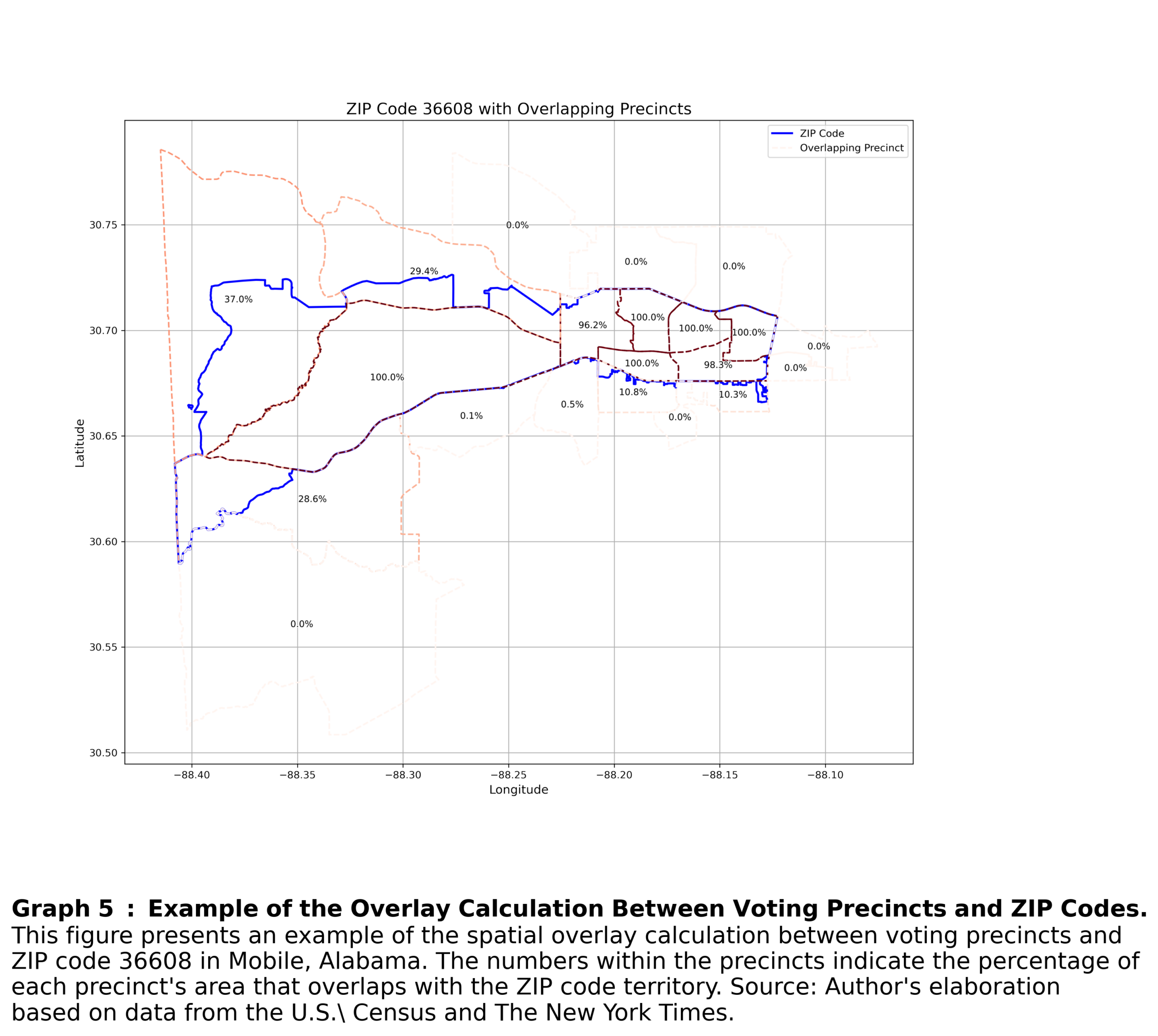
Another issue is that precincts and ZIP codes do not align exactly, and voting results are not reported directly at the ZIP code level. Therefore, I constructed a measure that weights precinct results based on the spatial overlap between each precinct and its corresponding ZIP code. I then calculate weighted average electoral results at the ZIP code level.
I proceed as follows. I begin with ZIP code polygon coordinates from the U.S. Census, combining 2010 and 2020 data to address potential boundary changes over time.
Next, I incorporate spatial election data from The New York Times and the University of Florida Election Lab. The New York Times provides precinct-level voting results from U.S. presidential elections, including votes cast for each candidate and the corresponding spatial polygons. These data enable the precise calculation of precinct-to-ZIP code overlap.
However, the New York Times dataset does not provide full national coverage for every state in each presidential election. For states not covered, I supplement the analysis with data from the University of Florida Election Lab. When precinct-level data are partially missing, I proceed as follows: if less than 70% of a ZIP code’s area is covered by precincts in the New York Times data, I compute coverage using the University of Florida Election Lab dataset. If that dataset provides higher coverage or more complete vote counts, I use it instead; otherwise, I retain the New York Times data.
An example of this overlay calculation is shown in Graph 5.